ShopDreamUp AI ArtDreamUp

Did I mention i have a comic out?
'Planet of Daemons' from Amigo comics, written by Kevin Gunstone drawn by me and colored by Stephan Mrkonjic (issue 1 of 4) went on sale 30th of November Issue 2 is out late December, Issue 1 should be available through Comixology shortly and the rest up to 4 eventually
just sayin...
link http://amigocomics.com/?p=1467
Paul
The project didnt get the final go ahead
The project i mentioned in my previous journal didnt get the final go ahead :( The writer is hopeful to get it published by a another publisher so it may see the light of day, i have to admit to a pinch of disappointment, but to me it cant overshadow the initial offer of work from a professional publisher, which is what im taking from all this :)
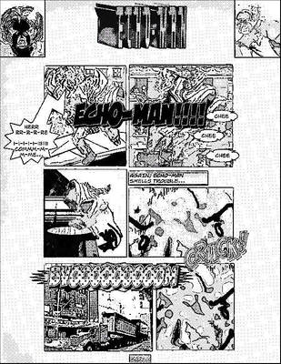
A teaser
I get regularly slagged off at the Glasgow drink and draw and sometimes its because i dont actually have a comic published in print form, well that may change now...ive been given a preliminary go ahead to draw a four part comic book series, at the moment i cant mention the title or the company, its not one of the big names (yet), but i was impressed with their roster of artists and writers and if it goes ahead it will be published and sold both sides of the Atlantic :D
I will be at the MCM Glasgow Convention 6-7th sept
Some of the gang at the Glasgow drink and draw persuaded me to get a stall at the MCM Glasgow Convention, so ill be in the comic village, ill be selling sketches and prints and chatting of course, so if anyone drops by say hello, im terrified ill just be ignored
© 2012 - 2024 Paul-Moore
Comments20
Join the community to add your comment. Already a deviant? Log In
Well, I'm an architect. So you'd assume I LOVE backgrounds. To be honest, the hardest part about them is when you force the constraint of the small panel box on what is a much larger construction framework to do them right in perspective. I have always caught myself cheating on backgrounds, doing freehand, etc out of laziness because of not wanting to do all that construction. It's one thing that digital construction has REALLY helped with. Lot easier to build good framework if you do the building blocks of it digitally and then draw over that... or even do all of the background digitally.
My sequential work relies on good backgrounds quite a bit because it's set in a real world vibe... I can't get away with as much of the minimal background stuff as I could on other stuff. But even then, I actually like my work best when I do it right.
One tip: Wally Wood's infamous 22 Panels that Always Work. Sure it's more speaking to panel composition and flow, but it's a good reminder to me of when and how to use the camera to focus on certain targets and therefore eliminate unnecessary detail that would not be ultimately needed.
Another tip: draw the foreground figures, then add the word balloons FIRST, before going farther than a simple rough on the background. I can't tell you how frustrating it is to render a full perspective city scene and then have most of it gobbled up by word balloons. Allow the flow of the panel, after lettering, to dictate what detail you put in behind it.
Another tip: Darren Taylor, a member of my TRDL R3 Forum and collaborator on projects, posted a video some years back on how he uses a grid system in Photoshop to help layout his panels. His video is specifically about putting the FIGURE in perspective. I think that's the value. There are any number of video tutorials on how to layout basic one to three point perspectives for backgrounds, but I rarely see someone think through the perspective on the figure themselves in order to work out foreshortening and other compositional details. Check it out:
[link]
Final Point: A technique used extensively in architectural rendering with conventional materials is to build a 3d model and print it wireframe, then ink over that. These days, most studios go for the entirely CGI renderings for their architectural presentations but I'm from the school of practice where you want to watercolor the rendering. The technique is to build the model, then go wireframe or hidden line, print that, in the case of watercolor, in yellow ink onto the watercolor paper, and then paint over it. For the comic analogue, where building a model is especially helpful is that once you model the massing for the spaces, both inside and out, that your scenes utilize, you can then move the camera around and find the perfect shots, then save them and build your art over that. Unfortunately there are more BAD examples of this than good, as some artists have taken to inking not only modeled backgrounds but figures in Poser, which is not the direction I'm talking about. I have always intended to use this approach with my comic work but have never found the time to complete the modeling, and impatiently dove right into the art. But it's the smart play.
You can use Google Sketchup for free...